Archive for the 'Visual Arts' Category

Conundrum: Pic Tac Toe II

Tuesday, September 4th, 2007

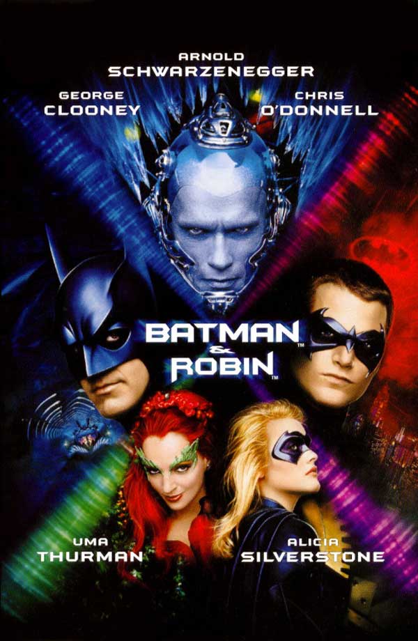
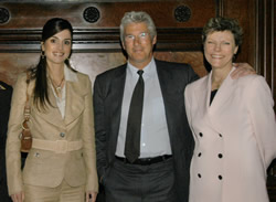
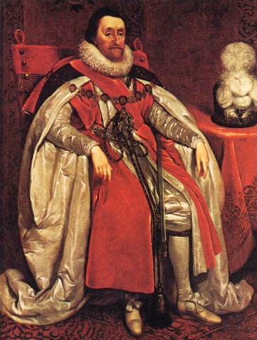
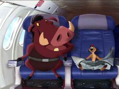
In a “Pic Tac Toe” puzzle, there are nine pictures in a three-by-three grid, like Tic-Tac-Toe. In each row, column, and diagonal, there is a common theme that unites the three pictures. The challenge is to find the eight themes.

You can click on each image to see a larger version:


Please post whatever you come up with in the comments section.

Enjoy!

UPDATE: Correct themes provided by Annalisa (6) and Neel Mehta (2). See comments for all answers.

To Have My Cake and Eat It Too

Monday, September 3rd, 2007

Yesterday, I hosted a reading of King Lear. It happened to be my birthday, so I wanted to get a cake. But since it was a King Lear reading and not a birthday party, I wanted to get a cake that would be King Lear appropriate. Here’s what I came up with:

Fortunately, my friends have a more traditional sense of birthday practice, and surprised me with a proper birthday cake:

Chocolate cake, vanilla cake, friends, and a King Lear reading: who could ask for a better birthday?

Conundrum: Pic Tac Toe

Tuesday, August 28th, 2007

I grew up reading Games magazine, so I was delighted when Ken Jennings posted a good old “Pic Tac Toe” on his blog. But when he recently posted a plea for others to do likewise, I thought it would be a good time to bring Conundrum out of its summer hibernation.

In a “Pic Tac Toe” puzzle, there are nine pictures in a three-by-three grid, like Tic-Tac-Toe. In each row, column, and diagonal, there is a common theme that unites the three pictures. The challenge is to find the eight themes.

You can click on each image to see a larger version:


I don’t have a message board like Ken has, so just post whatever you come up with in the comments section.

Enjoy!

UPDATE: Correct themes provided by Annalisa (4) and DeLisa (2). Alternate theme suggested by DeLisa (1). See comments for all answers.

Retargeting

Wednesday, August 22nd, 2007

They say a picture is worth a thousand words. But what if you only have room for 650? Enter “Content Aware Image Resizing” or the retargeting of images:

This is truly amazing, another step in the ongoing campaign to make images as dynamic as text in the XML Internet.

It does raise some questions about the medium of photography, though. This isn’t the first time images have been digitally altered to be sure, but there does seem to be a difference here. To begin with, a photograph should not be mistaken for reality. Photographers make choices, and a photograph is a selective representation of the world. A resized photograph, I would argue, is basically the same photograph. A cropped photograph is not, but it can be considered another photograph, as it is a different selective representation of the real world. A digitally altered photograph can no longer be considered a photograph in the same way, but it remains a visual representation of an imagined world.

What, then, is a retargeted image? It is a new concept for a new world. Take the example of the image of the two figures on the beach (about 46 seconds into the video). Resizing the image would make it hard to see the figures. Cropping the image would lose one of the figures. Retargeting the image keeps both figures in their current size, and loses only the beach between them. This may seem like an ideal solution, but what is lost is the distance between the two figures. That is a major element of this photograph. It was deleted, not for artistic or functional purposes, but for practical purposes, to help it fit better on the page. The thousand words represented by a picture can now be cut down to just the verbs and nouns. And one imagines this being one day automated, even built into Web browsers of the future – a future where everything is as adjustable as Quick Text Shakespeare, and with similiar nuance.

Even the phrase “Content Aware Image Resizing” gives me the willies in the same way that the term “content provider” seems to imply that the content is just one of many elements that make up a deliverable product. Under this system, Shakespeare was a content provider. And the process described in the video is not aware of content. For that, you still need a human.

I know I’ve blogged favorably about the changes the Internet is bringing to society, and many of them are inevitable, but others are not, and we have a responsibility to keep up with the changing definition of information literacy. Now we have one more question to ask ourselves when we see a photograph online.

I was originally posting this because I thought it was way cool. But I don’t want us to be so dazzled by the new technologies that come out that we stop asking the critical questions.

In Other Words

Monday, August 20th, 2007

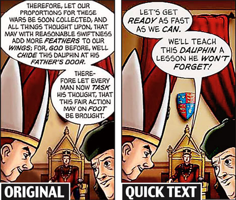
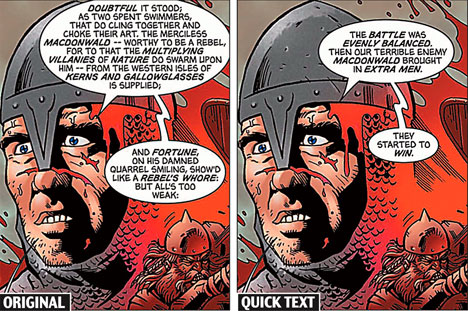
Via News on the Rialto we find an article about comic book versions of Shakespeare’s plays with updated simplified language:

Shakespeare’s plays are being rewritten as comic strips for pupils who find his poetry boring, it emerged today.

Thousands of teenagers are to study cartoon versions of famous plays such as Macbeth which reduce finely-crafted passages to snappy phrases.

The publishers hope the comics – illustrated by artists who have worked on the Spiderman series – will inspire disaffected readers with a love of the Bard’s plays.

No disrespect to Spiderman, but this won’t instill anyone with a love for anything, and certainly not the Bard’s plays. Shakespeare writes using the language of poetry, which means that every word choice is significant. The interplay, music, and structure of the language is fundamental in Shakespeare’s development of plot, character, and theme. You can’t just use your Spidey sense to paraphrase this stuff and call it Shakespeare.

The Shakespeare Geek demonstrates why.

I actually like the idea of comic book versions of Shakespeare plays, as long as they use the original language. You can even abbreviate the language in comic book form. But once you take away the language, you are no longer reading Shakespeare. It’s not even dumbed-down Shakespeare. You may as well just read something else.

For example, you may wish to read these comic books that deal with delicate problems for children. It seems that even Spiderman has a secret.

That’s what you get for messing with Shakespeare.

Photo Fun

Sunday, August 19th, 2007

Visible Earth

Sunday, August 12th, 2007

This spectacular “blue marble” image is the most detailed true-color image of the entire Earth to date. Using a collection of satellite-based observations, scientists and visualizers stitched together months of observations of the land surface, oceans, sea ice, and clouds into a seamless, true-color mosaic of every square kilometer (.386 square mile) of our planet. These images are freely available to educators, scientists, museums, and the public. This record includes preview images and links to full resolution versions up to 21,600 pixels across.

You can view the high-resolution image and more on the NASA website.

Arts Education

Sunday, July 29th, 2007

The Center on Education Policy released a disturbing new study this week, measuring the effects of No Child Left Behind:

The report finds that approximately 62% of school districts increased the amount of time spent in elementary schools on English language arts and or math, while 44% of districts cut time on science, social studies, art and music, physical education, lunch or recess.

Now, I’m pretty much appalled by all of the cutbacks, but I’ll leave the bulk of it to ScienceTeacher.com, SocialStudiesTeacher.com, and LunchTeacher.com. I’m ShakespeareTeacher.com, so I want to talk about arts education.

(And let’s make no mistake – the extra time being spent on ELA isn’t being spent on literature. It’s being spent on test prep, and more test prep.)

Arts education is absolutely essential for students preparing for the world that we’re currently living in. With the image continuing to gain dominance over the written word, people who can demonstrate artistic ability are highly marketable in today’s economy. From graphic designers to documentary filmmakers, those who can master today’s tools of communication are able to command a wider audience and expand their range of communication. In the connected world, this is real currency.

And even if all of that weren’t true, the arts teach us how to identify problems and solve them with creativity and discipline. Those skills help us in any endeavor.

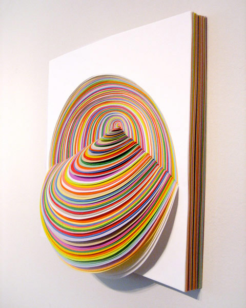
I came across a website for an artist named Jen Stark, who creates sculptures from construction paper that won’t help anyone pass a reading test any time soon. But they bring beauty into the world, which is worth at least a link from my blog. Take a look at her work, and tell me she didn’t have to develop some pretty sophisticated math skills along the way.
Or take French artist Huber Duprat, who recruited caddis fly larvae, who typically create protective shells out of silk and their surrounding materials, and placed them in an environment of gold flakes and precious gems. The result is a combination of art and science that boggles the mind. Click the picture below to see the video.

Or take a look at the Universcale by Nikon, an application of the mathematics of scale to allow human comprehension of the natural universe, and tell me your appreciation of it isn’t primarily aesthetic.

I wonder what Leonardo DaVinci would have thought about eliminating arts education to teach math. What would Shakespeare have thought about eliminating arts education to teach literacy? What would Descartes say about eliminating science to teach math? What would Hemmingway think of eliminating social studies to teach literacy?

Reading and math are important skills. But even if an educational system were somehow able to acheive 100 percent literacy and numeracy, and nothing else, it would still be a failure.

Women in Art

Saturday, June 2nd, 2007

Via The Media Dude:

500 Years of Women in Art. Check it out!

Not only is it mesmerizing to watch the paintings morph, but after a few viewings it becomes really fascinating to see the progression of different styles of art, from the early Renaissance masters through to the abstract art of the 20th century. In some cases, the changes seem gradual, but in other cases, they seem wild and revolutionary. I think I have some serious research to do before I can fully appreciate this video. But let me just watch it one more time…

The Animaniacs Do Midsummer

Saturday, April 28th, 2007

One more from the WB…